Stop Writing Media Queries: Master Responsive CSS with clamp()
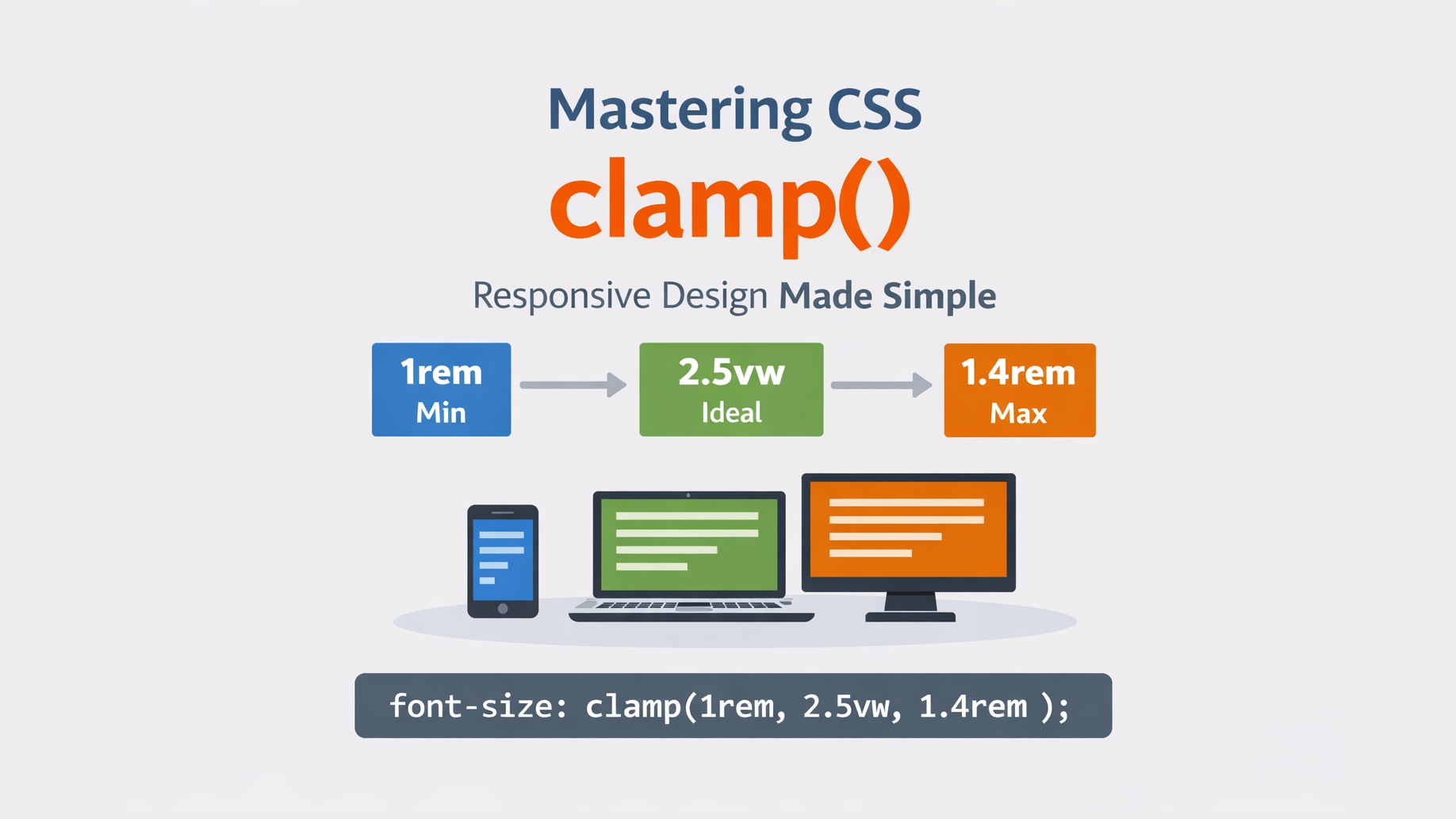
Responsive design has always been one of the biggest challenges in front-end development. Traditionally, we use media queries to control font sizes, spacing, and layout across different screen sizes.
But now, CSS gives us a powerful function called clamp() that lets us write fluid responsive values in one line - without multiple breakpoints.
Let’s understand what clamp() is, how it works, and when to use it.
🔹 What is clamp()?
clamp() is a CSS function that allows you to set a value with:
- a minimum value
- a preferred (ideal) value
- a maximum value
Syntax:
clamp(min, preferred, max)The browser will choose a value that:
- is at least min
- tries to use preferred
- is never more than max
Basic Example:
.heading {
  font-size: clamp(1.5rem, 5vw, 3rem);
}
Responsive Heading with clamp()
Resize the browser window to see the text scale.
Meaning:
- Font size will never be smaller than 1.5rem
- It will grow based on viewport width (5vw)
- It will never exceed 3rem
So the text smoothly scales between screen sizes – without media queries.
🔹 Why Use clamp()?
| Feature | Benefit |
|---|---|
| No media queries | Less CSS to maintain |
| Fluid scaling | Smooth resizing instead of jumps |
| Readable limits | Prevents text becoming too small or too large |
| Cleaner code | More maintainable styles |
🔹 Real-World Use Cases
-
Fluid Typography
p {
  font-size: clamp(1rem, 2.5vw, 1.4rem);
}-
Responsive Spacing
section {
  padding: clamp(1rem, 4vw, 3rem);
}-
Responsive Container Width
.container {
  width: clamp(300px, 80vw, 1100px);
}🔹clamp() vs Media Queries:
| Media Queries | clamp() |
|---|---|
| Multiple breakpoints | Single line |
| Hard jumps | Smooth scaling |
| More CSS | Cleaner |
| Device-based | Viewport-based |
🔹 Common Mistakes
❌ Using fixed units only:
clamp(16px, 20px, 24px);This removes responsiveness.
✔ Better:
clamp(1rem, 2vw, 1.5rem);
❌ Setting min larger than max.
🔹 Conclusion
clamp() is one of the most useful modern CSS functions. It helps you create fluid, responsive designs with clean, maintainable code — and often replaces many media queries.
If you're building modern UIs, you should definitely start using clamp().
🔹 Browser Support
clamp() is supported in all modern browsers:
- Chrome 79+
- Firefox 75+
- Edge 79+
- Safari 13.1+
So it’s safe to use in production.