CSS Flexbox Explained: Align Layouts with Ease
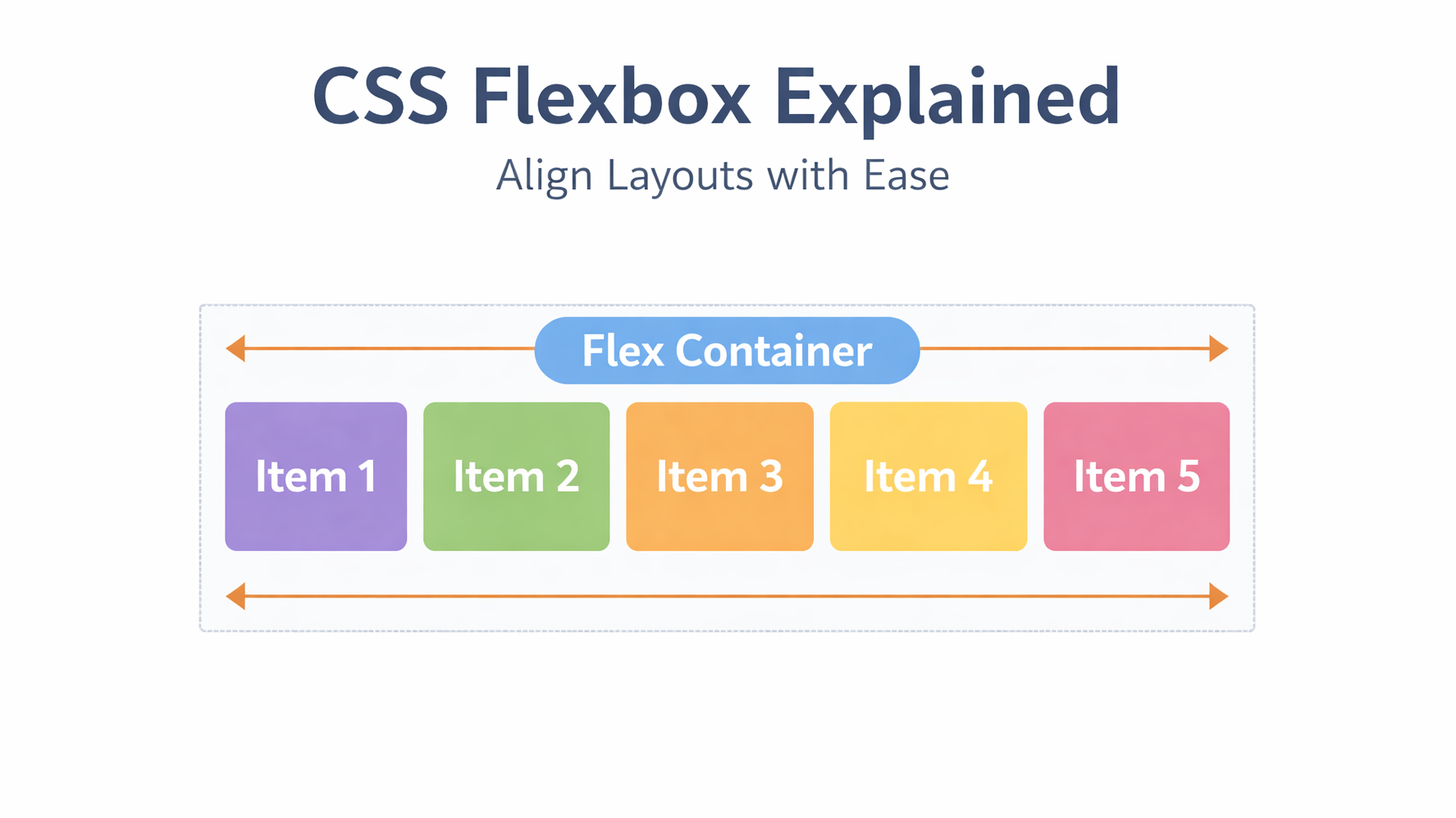
CSS Flexbox is designed to solve one main problem:
Aligning items easily in a row or column
Before Flexbox, alignment was painful.
Now, it’s simple, clean, and predictable.
🔹 What is CSS Flexbox?
Flexbox is a one-dimensional layout system.
It works in:
- Row (horizontal) OR
- Column (vertical)
Flexbox is best for components, not full page layouts.
🔹 Basic Flexbox Concept
To use Flexbox, you need:
- A flex container
- Flex items inside it
Example 1: Horizontal Layout (Row)
.flex {
  display: flex;
}
Item 1
Item 2
Item 3
Example 2: Center Items (Most Common Use Case)
.flex {
  display: flex;
  justify-content: center;
  align-items: center;
}
Centered
Example 3: Space Between Items
.flex {
  display: flex;
  justify-content: space-between;
}
Left
Right
🔹 When to Use Flexbox
Use Flexbox when you need:
- Alignment
- Spacing
- One-direction layouts
- Navigation bars
- Buttons
- Cards
🔹 Common Flexbox Mistakes
❌ Forgetting display: flex
❌ Confusing justify-content and align-items
❌ Using Flexbox for complex page layouts
✔ Best practice:
- Use Flexbox for inside layouts
- Use Grid for overall structure
🔹 Conclusion
Flexbox makes alignment easy and predictable.
If you understand Flexbox well, your UI code becomes cleaner and more professional.