Master the Art of CSS Positioning: From Lost at Sea to Captain of the Grid
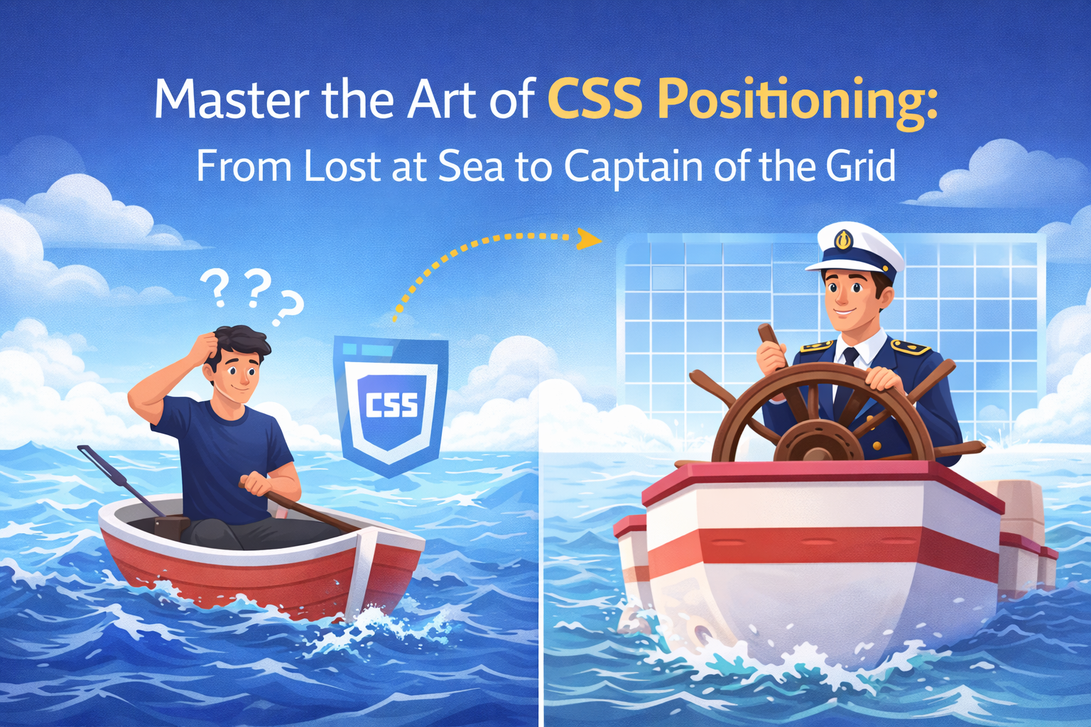
Ever felt like you were playing a high-stakes game of Tetris, but the pieces just wouldn’t go where you wanted? Welcome to the world of CSS Positioning. It’s the difference between a website that looks like a professional digital masterpiece and one that looks like a pile of digital laundry.

Ever felt like you were playing a high-stakes game of Tetris, but the pieces just wouldn’t go where you wanted? Welcome to the world of CSS Positioning. It’s the difference between a website that looks like a professional digital masterpiece and one that looks like a pile of digital laundry.
1. The Default: static
Every element starts its life as static. Think of this as "The Queue." Elements just follow the natural flow of the HTML document, stacking one after another.
- Behavior: Top, bottom, left, and right properties do nothing here.
- Vibe: The rule-follower who never cuts in line.
2. The Nudge: relative
position: relative; is the "It's not you, it's me" of CSS. The element stays in the flow of the page, but you can nudge it around without affecting its neighbors.
- How it works: If you move a relative box 20px down, it leaves a "ghost" space where it used to be. The other elements don't move to fill the gap.
- Pro Tip: This is most commonly used as a "container" for absolute elements (more on that in a second).
3. The Rebel: absolute
This is where things get spicy. When you set an element to absolute, it leaves the normal document flow entirely. It’s like it’s floating on a different layer.
- The Anchor: It positions itself relative to its nearest positioned ancestor (anyone with relative, absolute, or fixed). If it can't find one, it maps itself to the
<body>. - The Result: Other elements act like the absolute element doesn't even exist. They’ll slide right under it.
4. The Stalker: fixed
Want a navigation bar that follows the user as they scroll? That’s fixed.
- Behavior: It is positioned relative to the viewport (your screen).
- The Catch: No matter how much you scroll, a fixed element stays in the exact same spot on the glass of your monitor.
5. The Hybrid: sticky
sticky is the best of both worlds. It acts like relative until the user scrolls to a specific point, then it turns into fixed.
- Common Use: Table headers or "Back to Top" buttons.
- Requirement: You must specify a threshold (like
top: 0) for the "stick" to trigger.
Scroll down to see the magic...
Still here?
Yep, I'm still at the top.
Comparison Cheat Sheet
| Property | Relative To | Stays in Flow? | Common Use Case |
|---|---|---|---|
| static | Natural document flow | Yes | Default behavior |
| relative | Its original position | Yes | Nudging elements / Parent container |
| absolute | Nearest positioned parent | No | Overlaying text on images |
| fixed | Browser window | No | Sticky navbars / Chat bubbles |
| sticky | Scroll position | Partially | Section headers |
The Secret Weapon: z-index
When elements start overlapping, who gets to be on top? That’s where z-index comes in.
Imagine your screen has a "Z" axis coming out toward your face.
z-index: 1is the bottom of the pile.z-index: 9999is the king of the mountain.
Note:z-indexonly works on elements that have a position value other thanstatic.