CSS Grid Explained: Build Modern Layouts Easily
Creating layouts used to be difficult in CSS.
Developers relied on floats, hacks, and complex calculations.
CSS Grid changed everything.
It allows you to create rows and columns at the same time, making layouts clean, powerful, and easy to maintain.
🔹 What is CSS Grid?
CSS Grid is a two-dimensional layout system.
That means it works with:
- Rows
- Columns
At the same time.
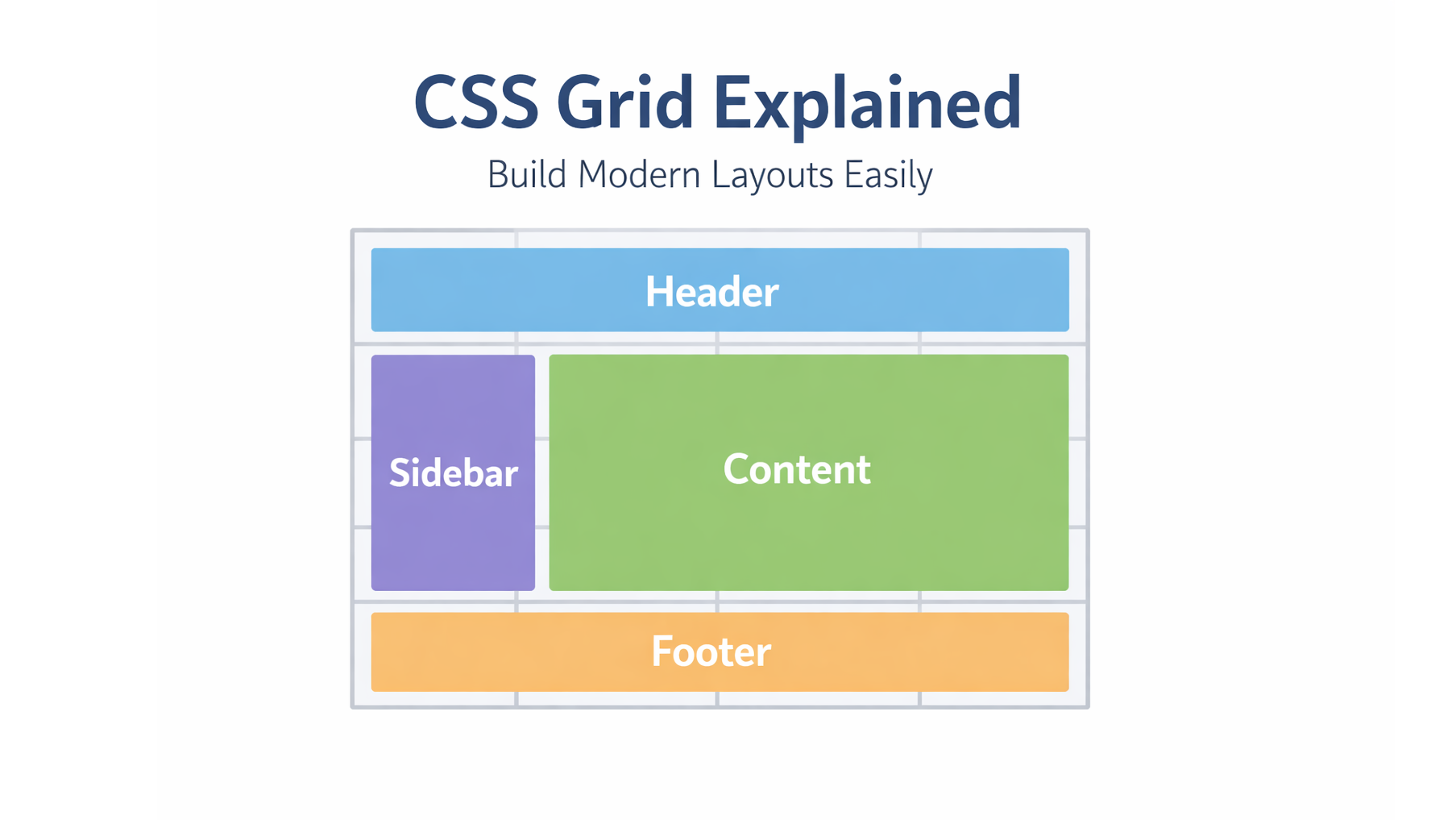
CSS Grid is best for page layouts, dashboards, and structured designs.
🔹 Basic Grid Concept
To use Grid, you need:
- A grid container
- grid items inside it
Example 1: Simple 2-Column Layout
.grid {
  display: grid;
  grid-template-columns: 1fr 2fr;
  gap: 10px;
}
1fr 2fr means:
- Sidebar = 1 part
- Main content = 2 parts
🔹 Grid Columns Explained
grid-template-columns: 200px 1fr 1fr;
This creates:
- Fixed column (200px)
- Two flexible columns
Example 2: 3-Column Card Layout
.cards {
  display: grid;
  grid-template-columns: repeat(3, 1fr);
  gap: 16px;
}
repeat(3, 1fr) = three equal columns.
🔹 Rows in CSS Grid
You can also control rows:
grid-template-rows: auto 200px;
Example 3: Grid with Rows
.layout {
  display: grid;
  grid-template-columns: 1fr 3fr;
  grid-template-rows: auto 1fr auto;
  gap: 10px;
}
🔹 Grid Gap (Spacing)
Instead of margins, Grid gives you:
gap: 20px;
This adds space between rows and columns.
🔹 Why Use CSS Grid?
| Feature | Benefit |
|---|---|
| Two-dimensional | Rows + columns |
| Clean code | Less hacks |
| Responsive friendly | Works great with fr |
| Layout control | Perfect for pages |
🔹 Common Beginner Mistakes
❌ Using Grid for one-line layouts
❌ Forgetting display: grid
❌ Overusing fixed widths
❌ Relying on px or % for Grid Columns
✔ Best practice:
- Use
fr - Keep layouts flexible
- Combine Grid + Flexbox
🔹 Conclusion
CSS Grid makes layout building simple, readable, and powerful.
If you are building:
- Dashboards
- Blogs
- Admin panels
- Landing pages
CSS Grid should be your first choice.